How to Use of Color - photography guide for beginners
Color has such a monumental significance in photography that it’s strange to think that color photography only became more popular than black and white in the 1970s. Since then the world of colors has introduced a whole new axis of interpretation to photography, and exploring color theory has become invaluable for every designer and photographer. In this comprehensive guide, we’ve accumulated everything you need to enhance your understanding of color in photography. Let’s follow the rainbow.
Colorize Images Instantly With Picsart
Colorize your basic images and turn them into your favorite hues in a single click with Picsart’s color effects and filters.Colorize Your Image
What is Color?

Visually, color is associated by the measurement of three properties: hue, brightness (or luminance), and saturation.
- Hue
A hue is the general definition of a color. It’s how we perceive, recognize that a color is red, blue, green, etc. A hue includes all gradations of a color, from its lightest tint to its darkest.
- Value
Value is also known as luminance or brightness. It ranges from 0 (black) to 100 (white) and determines how light a color is.
- Saturation
Saturation also ranges from 0 to 100 and determines how intense or pure a color is. Low saturation means a color is close to grayscale.
Camera vs. The Human Eye | what is the Difference
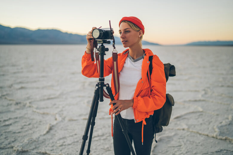
It is said that the design of the first camera was inspired by the human eye, but still there is a remarkable difference - how the human eye perceives colors and how a camera does.
A camera’s sensor captures light as it is, while the brain is constantly in the process of modifying light and interpreting an image information according to its own.
That’s why some people saw the dress that went viral a couple of years ago as blue and black, while others saw it as white and gold: color perception is processed on the information filled in by the brain according to its previous experiences.
A digital camera, working on pixels, uses thousands of light cavities to capture and then assess the electrical signals which measure the strength of the captured photons for any given pixel.
Need to understand the Colors
To improve the use of colors and understanding of color in photography, we need to get familiar with the color system and organisation of colors:
Check this Wheel of colors
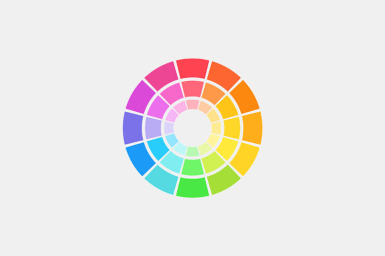
The color wheel is one of the most popular ways of organizing colors and theorizing about them. It is a way to demonstrate the relationship between primary, secondary, and tertiary colors geometrically.
The color wheel is also useful in figuring out classical color combinations often used in designs. You can read more about the color wheel and color theory in this article.
which are Primary Colors ?
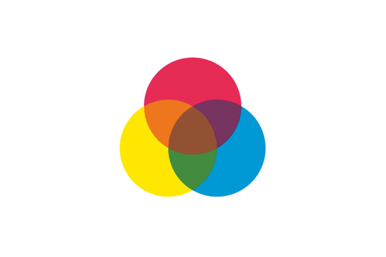
The three primary colors in the RGB color model are red, green, and blue. On the color wheel, the primary colors divide the circle into three equal parts.
what are Secondary Colors ?
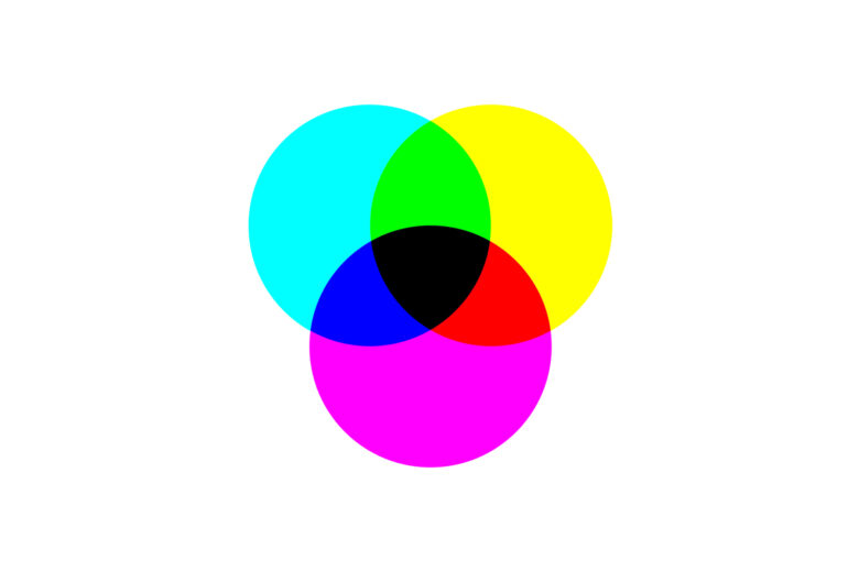
Secondary colors – magenta, cyan, and yellow – are the colors you’ll get if you mix two primary colors in equal measure. For example, mixing together blue and green will result in cyan. Thus, cyan is equally distanced from blue and green on the color wheel.
Tertiary Colors
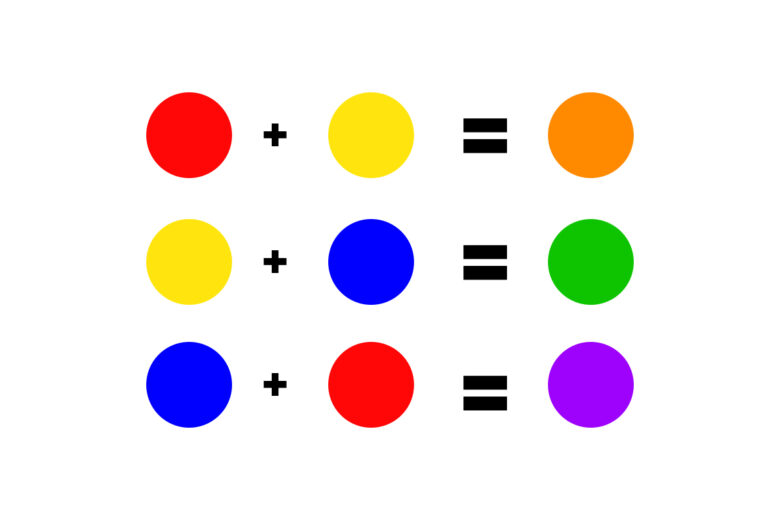
Tertiary colors are what you get when you mix a primary color with a secondary color close to it on the wheel. They are rose (red-magenta), azure (blue-cyan), red-yellow (orange), green-yellow (chartreuse), blue-magenta (violet), green-cyan (spring green).
Different Color Schemes
Most designs start with a selected color scheme, and here the color wheel offers some tried and tested combinations. The most common three are monochromatic, analogous, and complementary, but of course, you can expand your horizons later.
Monochromatic

There are few color palettes as easy to work with as monochromes. A monochromatic palette is essentially a palette of one hue. It includes some of the shades and tints of a single hue.
Analogous
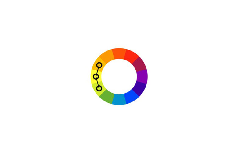
An analogous color scheme is made up of three colors that are next to each other on the color wheel. For example, you can take red, red-orange, and orange.
Analogous palettes are famous for their harmonious and pleasant look. Generally, a designer or photographer will pick one dominant color and use the other two as complements.
Complementary colors
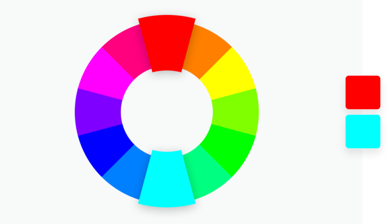
Complementary color schemes demonstrate the old adage of opposites attracting. Well, here opposites on the color wheel complement each other, thriving off of the tension they create and inviting the viewer to really notice and appreciate the use of color in photography or design.
What is the Psychology of Colors?
In part, the meanings of color are shaped by localized cultural norms and social influences, but you can’t deny the direct and universal influence some colors have on the human psyche.
To truly master color photography, you should delve deep into the emotional meanings of different colors.
The general rule is that warm or dominant colors (orange, red, and yellow) evoke and inspire passion and enthusiasm, and symbolize positivity, strength, and intensity. On the other hand, cold colors (greens, blues, purples) soothe and calm, symbolizing reason, quiet, and contemplation.
For a more in-depth understanding of color in photography, here are the key meanings of each color:
White: A neutral color that stands for openness, cleanliness, serenity, innocence, and clarity. White is a color that is present in almost any photo.
Black: Another versatile neutral with many meanings. Black is mysterious, elegant, powerful, and formal. Some of its darker meanings are grief, death, and evil.
Gray: Gray is a refined, if somewhat conservative, neutral that combines really well with the warmer colors. It communicates balance and steadiness.
Red: The loudest color in all of color psychology, red symbolizes passion, vitality, pain, love, and vigor. It is, of course, the color of anger, blood, and courage.
Pink: Pink is all about youthfulness, femininity, innocence, and tenderness. A lot of people find comfort and kindness in pink.
Blue: Blue is most people’s favorite color. It stands for peacefulness, dreaminess, relaxation, and order.
Green: Nature’s favorite color, green is associated with vitality, renewal, tranquility, and generosity.
Orange: Orange is the color of creativity, energy, warmth, and playfulness.
Yellow: Yellow is the color of optimism, childlike curiosity, zeal, and light-heartedness.
Brown: Reliable and safe, brown symbolizes honesty, resilience, loyalty, and growth.
Purple: Eclectic and multi-faceted, purple stands for magnanimity, nobility, originality, and spirituality.



This is an amazing guide for beginners on using color in photography! I love how it breaks down hues, saturation, and value, and also explains color psychology so thoroughly. For anyone looking to enhance their photos even further, using remini apk premium can bring out colors beautifully and restore image details for professional-looking results.
ReplyDelete